
The glossary
Published:
Last updated:
Landing page – what it is, how to build one and what actually converts
Definition
A landing page is a standalone web page with a single purpose: to get the visitor to take one specific action – fill in a form, book a meeting or buy a product. Everything on the page is optimised for that goal.
What is a landing page?
A landing page is a standalone web page where a visitor lands after clicking an ad, a link in an email or text message, or an organic search result.
What defines a landing page is not the design but its intent. The page is created for a specific traffic source and a single conversion goal. Everything else is removed. Landing pages are used for Google Ads, Meta campaigns, LinkedIn, email and text message campaigns, and organic search traffic.
Examples of landing pages that convert well
Concrete examples are the quickest way to understand what separates an average page from one that actually converts.
A real example: support for companies in northern Sweden
Tillväxtstöd helps companies in Sweden apply for government grants. Its page for northern Sweden targets only companies with employees there, and the set-up puts several points from the checklist further down into practice:
- The headline is a question the visitor can answer yes to: "Do you have employees at a site in northern Sweden?" (translated from Swedish). The line below says what it could be worth.
- A first step with two fields: company registration number and, optionally, municipality. Contact details are only requested in the next step.
- The risk is removed before the form: the analysis is free of charge, and the company only pays once the grant has been awarded.
- The main menu is removed: all that remains is a discreet menu button with a single link to the main website, for anyone looking for other grants.
- Proof and answers to objections: testimonials with first names and companies, logos and answers to objections such as "we already have an accounting firm".
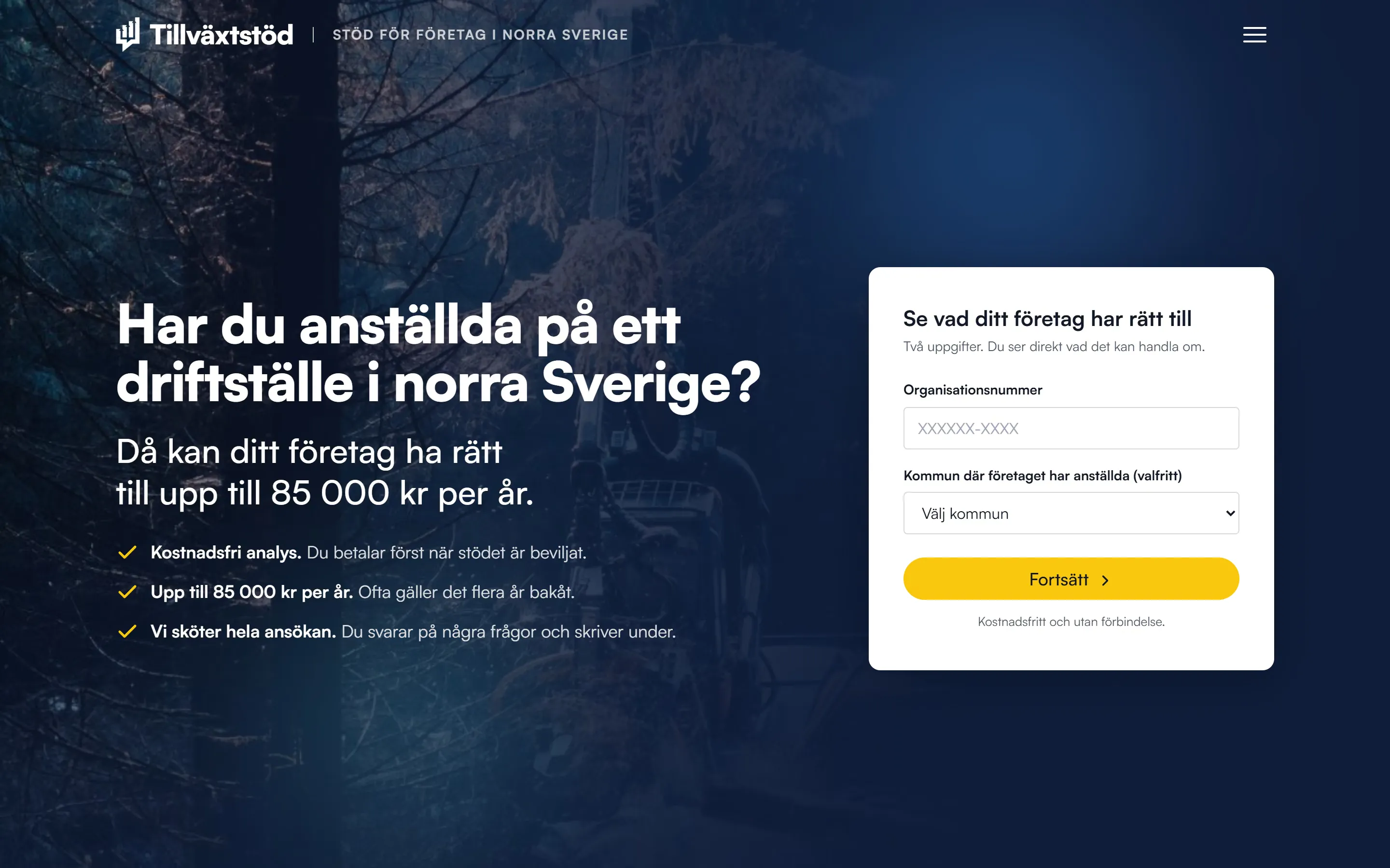
Open the page (in Swedish) or read the case study on Tillväxtstöd.
E-commerce – a seasonal campaign page
A well-built Black Friday landing page combines a countdown timer, product images, delivery terms and Trustpilot reviews, all visible without scrolling. The conversion goal is a click through to the checkout – not a completed purchase. The landing page warms the visitor up; the checkout page converts. The most common mistake is measuring conversion on the landing page instead of on actual purchases.
Service businesses – lead capture
An effective B2B landing page has a low-commitment offer (a free strategy meeting), no more than three form fields and at least one concrete customer result with figures. A longer sales cycle calls for more social proof: case studies, logos and certifications.
Event registration
Event landing pages have built-in conversion drivers: date, venue and a limited number of places create a natural sense of scarcity. The form should not ask for more than three pieces of information.
What separates a landing page from an ordinary website?
A website has many purposes: presenting the company, showing services and guiding the visitor in different directions. A landing page does one thing. The navigation menu and side links are deliberately removed – nothing should lead the visitor anywhere but to the conversion.
Pages that force the visitor to choose between several competing offers usually convert worse than pages with a single, focused goal – every extra choice increases the risk that the visitor does nothing at all.
How many landing pages should you have?
As many as you have distinct offers, campaigns or audiences – no more. Every landing page should match a specific intent: one page per campaign, per service or per search intent. More targeted pages give better message match and capture more long-tail traffic, but only if each page has its own purpose and its own content. Thin, near-identical pages competing for the same keywords do more harm than good.
What types of landing page are there?
Landing pages are categorised by purpose and traffic source – not by platform or industry.
By purpose
- Lead capture page – Collects contact details through a form. Common for B2B and service businesses. The offer (a guide, a webinar, a free consultation) has to give the visitor a reason to leave their name and email address.
- Click-through page – Warms up the visitor and leads on to a purchase or booking. The page persuades – the next step converts. Common in e-commerce and SaaS.
By traffic source
- PPC landing page – Short and focused, matched to the ad message. Google weighs how relevant the ad and the landing page are when it ranks the ad, and higher-quality ads often get a lower CPC.
- SEO landing page – Longer, rich in content and built for the search intent. Costs nothing per visitor once the ranking is established.
- Email and text message landing page – Shorter pages for visitors who are already warm. Email is often the highest-converting traffic source: according to the Unbounce Conversion Benchmark Report (2024), email traffic converts at 19.3% on average, compared with a median of 6.6% for landing pages across all industries. The figures refer to conversions on the landing page itself, such as completed forms, not purchases.
By use case
- E-commerce – Product launches, campaigns, bundle offers.
- B2B and service businesses – Demo bookings, reports, quote requests.
- Events – Registration for conferences and launch events.
- Brand building – Softer conversion goals: newsletter sign-ups, social media followers.
What makes a landing page effective?
High-converting landing pages share a handful of elements regardless of industry. The order from top to bottom mirrors how visitors actually make decisions.
The structure of a high-converting landing page
- A hero headline that matches the traffic source – The headline carries the page: most visitors decide whether to stay or leave based on it. For PPC, the headline should contain the same keywords as the ad.
- A subheading with the value proposition – What does the visitor get, why now, why this particular service?
- Hero image or video – Video can lift conversion compared with a static page, but the effect varies with the offer, the page and the audience.
- Primary CTA above the fold – The button text should describe the outcome: "Book a free review" almost always works better than "Submit".
- Social proof – Customer logos, reviews and concrete results close to the CTA.
- Problem/solution – The visitor's pain point, linked directly to your solution.
- Features and benefits – Focus on the outcome for the customer, not on technical properties.
- Secondary CTA – Repeat it further down for visitors who read the whole page.
- Form – Keep the number of fields as low as possible, preferably 3–4 at most. Every extra field reduces the chance of conversion.

Checklist for an effective landing page
- A single CTA action per page
- The headline matches the traffic source (ad, email, keyword)
- Load time under 2.5 seconds (Google's threshold for a good LCP)
- Optimised for mobile – most of the traffic in most industries comes from mobile devices
- Navigation menu hidden or minimised
- Social proof within the first screen
- Max 3–4 form fields
- Credibility signals (logos, reviews, certifications)
- GA4, Meta Pixel and LinkedIn Insight Tag configured before launch
- A thank-you page on a separate URL for conversion tracking
- Touch targets on mobile at least 24×24 px (WCAG 2.5.8, level AA) – aim for 44×44 px for the best accuracy
How do you create a landing page?
Building a landing page takes eight steps. Skipping the early ones – mainly goals and tracking – costs more in lost insight than it saves in time.
- Step 1: Define the goal and the audience – Which action? Who is the visitor, and where are they in the buying journey?
- Step 2: Sketch a wireframe – Headline → hero image → CTA → social proof → problem/solution → features → CTA.
- Step 3: Write the content first – Write at least five headline options and choose the strongest. Designing around a fixed message is easier than the other way round.
- Step 4: Design around three principles – Visual hierarchy, contrast (the CTA should stand out) and readability (60–80 characters per line).
- Step 5: Choose a platform and build – Match the platform to the need: Webflow for quick visual editing, or a coded page with a headless CMS when performance and integrations matter most. Tools such as Unbounce or Leadpages suit simple campaign pages.
- Step 6: Get the technical basics right – Load time under 2.5 seconds, optimised for mobile, schema markup and tracking in place.
- Step 7: Verify the tracking – Confirm that GA4 records conversions correctly before you switch on the traffic.
- Step 8: Launch and iterate – A landing page is a hypothesis, not a finished project. Switch on the traffic, measure the results and improve. A/B testing may be worth considering.
Facing a bigger web project? New website 2026 – build or buy? helps you choose the right set-up.
Landing pages for e-commerce compared with service businesses
The set-up differs greatly depending on whether the visitor is meant to buy a product or hand over their contact details.
Landing pages for e-commerce
The click-through format dominates. The page warms the visitor up; the checkout converts. Key elements:
- High-quality product images – several angles and preferably video
- Delivery terms and returns policy visible without scrolling
- Trust signals: Trustpilot, reviews, certifications
- Seasonal campaigns need countdown timers and clearly limited availability
- Tracking, for example in GA4: measure actual purchases, not clicks to the checkout
Landing pages for service businesses (B2B)
The lead capture format dominates. A longer sales cycle calls for more proof.
- Credibility signals: customer logos, case studies with figures, certifications
- The offer has to have immediate value – for example a free guide sent straight away
- The form only asks for what you need for the next step
- Tracking: GA4 + CRM integration to track lead quality, not just volume
Landing pages for brand building
Storytelling-led, with a soft conversion goal: newsletter sign-ups, followers or stronger brand awareness.
How do you optimise a landing page?
Conversion rate optimisation follows a systematic process. Testing without a baseline is guesswork.
Four steps to better conversion
- Measure a baseline – Confirm that GA4, heatmaps and form tracking work. Measure conversion rate, CTA click-through rate, scroll depth and exit rate per section (calculate your conversion rate with our calculator).
- Identify bottlenecks – Use Hotjar or Microsoft Clarity (free) for heatmaps and session recordings. Funnel analysis in GA4 shows where visitors drop off. A structured UX audit often finds the bottlenecks faster than reading heatmaps yourself.
- Prioritise tests – Headline (biggest effect) → offer → CTA text → form length → placement of social proof → hero image.
- A/B test systematically – One variable at a time. Wait for a 95% confidence level and around 400 conversions per variant to demonstrate a 20% improvement. Tools: VWO, Optimizely or Webflow Optimize (compare A/B testing tools).
Quick wins
- Shorten the form one field at a time
- Change the button text: "Submit" → "Book a free demo"
- Move social proof closer to the headline
- Improve LCP – load time under 2.5 seconds
- Touch targets on mobile at least 24×24 px (aim for 44×44 px)
Thinking of bringing in help with conversion rate optimisation? Read CRO agency: what it costs and what you should demand.
Landing pages and SEO
An SEO-optimised landing page that also converts is one of the most cost-effective assets a website can have. It costs nothing per click and works around the clock.
What does it take to rank organically?
- Search intent first – The page has to match what the search engine expects. An informational page does not rank for a transactional keyword.
- Enough content – Typically 800+ words for competitive keywords, sometimes several thousand. Focus on quality and on insights that the pages at the top of the SERP do not offer.
- A technical foundation – Fast loading, mobile-first indexing, schema markup.
- E-E-A-T signals – Case studies, certifications, external source references.
PPC landing page vs SEO landing page
A PPC landing page is short and focused on conversion. An SEO-optimised landing page is longer and has to satisfy both the search engine and the visitor. Often the best option is a page that does both – a pillar page that ranks and converts.
| Criterion | Paid trafficPPC landing page | Organic trafficSEO landing page |
|---|---|---|
| Primary purpose | Maximise conversion from a specific ad | Rank organically and convert over time |
| Traffic source | Google Ads, Meta, LinkedIn (paid) | Organic search |
| Length and content | Short and focused, matched to the ad | Longer and rich in content, built for the search intent |
| Time to results | Immediate – as soon as the campaign is live | Weeks to months |
| Cost per visitor | Paid per click (CPC) | Close to zero once the position is established |
| Key metrics | Quality Score and CPC | Rankings, organic traffic, search intent |
| Keeps working when you stop paying | ||
| Best whentypical use case | Time-limited campaigns and quick validation | Long-term, recurring demand |
Local SEO and landing pages
Location-specific landing pages – "Webflow agency Stockholm" or "conversion rate optimisation Gothenburg", to take Swedish examples – rank better as dedicated service pages than as part of a general pillar page. The pillar captures informational searches; the service page captures the transactional ones.
Landing pages and AEO – do you show up when someone asks an AI?
More and more buyers ask an AI their first question instead of Google. ChatGPT, Perplexity, Gemini and Google's AI Overviews summarise the answer directly – and in doing so decide which companies get mentioned at all. A landing page built only for clicks and looks risks never being cited in those answers.
What makes a landing page citable for AEO is structure: clear, direct answers to real questions, semantic chunking, schema markup and an FAQ section. If the information is missing, an AI tends to answer "no" rather than "I don't know" when someone asks about your service – and you lose the deal before you even knew it existed.
AEO does not replace the basics of conversion – it is layered on top of them. The value lies in the combination: strategy and a business understanding of what the buyer needs to know, copy that people and AI alike want to cite, and a technical foundation that structures the page for machines. Technology alone produces no citable answers; copy alone does not structure anything for machines.
What does a landing page cost?
The price varies greatly depending on complexity and on whether the agency or you create the content.
In Sweden, building a simple campaign page with professional design from a brief typically costs around SEK 15,000–25,000 and can be delivered in 1–2 weeks. A more complex landing page costs around SEK 35,000–80,000, with a lead time of 2–4 weeks. For that, the agency handles strategy, design, A/B test set-up, development and conversion tracking. Ongoing CRO is normally priced as a retainer – depending on the number of pages and the complexity, an agreement is often between SEK 3,000 and 50,000 a month.
The biggest price factors are design complexity, integrations and choice of platform. It also matters whether the agency produces the copy and images, and whether it works from an existing design or handles strategy and design itself.
You will find what is included when we build landing pages on our landing pages service page.
Want to see what a whole web project costs over time? What does a website cost in 2026? covers the total cost of ownership and choice of platform.
How SEOS Design builds landing pages
We build landing pages on three principles: a single clear goal, a measurable conversion structure from day one, and optimisation for both Google and AI search engines. The difference between an average and an excellent landing page rarely lies in the design. It lies in how well the page matches the search intent, in the strategy behind the layout – and in how quickly you can adjust to how visitors actually behave.
Want to see the set-up and what is included? Landing pages from SEOS Design. Want to build a landing page that converts? Get in touch and we will look at what suits your specific goal.
Common questions about landing pages
What is a landing page?
A landing page is a standalone web page with a single purpose: to get the visitor to take one specific action – fill in a form, book a meeting or buy a product. Unlike an ordinary website, it has no navigation menu or distractions. Everything on the page is optimised for that one goal.
What is the difference between a landing page and a website?
A website has many purposes – presenting the company, showing services and guiding the visitor in different directions. A landing page has only one: getting the visitor to take a specific action, such as filling in a form or booking a meeting. The navigation menu and side links are deliberately removed, so that nothing leads the visitor anywhere but to the conversion.
Do I need a landing page if I already have a website?
Often, yes. The home page is built to serve many visitors and purposes at once, which makes it too broad for a single offer. If you are running paid traffic or a campaign with a specific goal, a dedicated landing page – with a single message and a single CTA – almost always converts better than sending the traffic to the home page.
How many form fields should a landing page have?
As few as possible – usually three to four fields. Every extra field lowers the likelihood that the visitor completes the form, so only ask for what you actually need for the next step. You can collect the rest later in the process.
What is a good conversion rate for a landing page?
It varies greatly between industries and traffic sources. According to the Unbounce Conversion Benchmark Report, the median is around 6–7% across industries, while the best-performing pages convert considerably higher. A more useful target than a general figure is to beat your own baseline – measure where you stand today and improve from there.
Ready for the next step?
Now that you know more about landing page, you may be wondering what your next step should be.
We are always happy to help and to answer any questions you have.
Book an intro call